Creativity Brought To Life
Inspiration


Rough Sketches


Photography


.jpeg)


.jpeg)

Designing

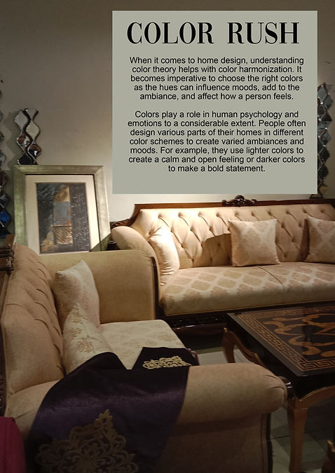


Following are the photoshop files for the magazine pages
Evaluation of design
I am quite content with how my preliminary magazine turned out. However, there indeed are a few areas where things could have been improved. I decided to base my magazine on interior designing. I used rather subtle colors throughout the magazine to make it seem very cozy, welcoming, and calming. I love real-life stories of people and wanted to include either an interview or a story of someone designing their house, hence went with the chair renovating story. Since this was my first magazine with a proper theme, I did extensive research and did take inspiration from many existing magazines. The two main covers I used for inspiration are attached above. I absolutely adore color palettes and made one before designing each page. I even included one in one of the pages to show what paints would be perfect for such furniture and love how it turned out.
On the contents page, there is this image of color charts which I took from the internet, since I couldn't find any charts in real life and was short on time. The image feels like it's been forcefully included and removing it or adding something else would improve it. Adding to this, more articles could have been added to improve it and to balance the image-text ratio.
Learning outcome
Making this preliminary magazine before my final magazine proved to be very helpful. For my practice magazine covers, content pages, and articles, I did not follow any particular convention or theme and they were very random. However, we were supposed to follow one theme for this magazine and I chose interior designing and home décor. This allowed me to make a product following the same conventions, i.e the color scheme and overall style to go together. Moreover, I had to do the photography myself which made me practice camera techniques and gave me an idea as to what orientation works best for a magazine. Furthermore, I now have an idea of how you write catchy cover lines and how one's choice of words impacts and attracts the audience. This task allowed me to explore the different conventions of a magazine and eventually led me to not make the same mistakes in my final magazine.